Project Overview
The product:
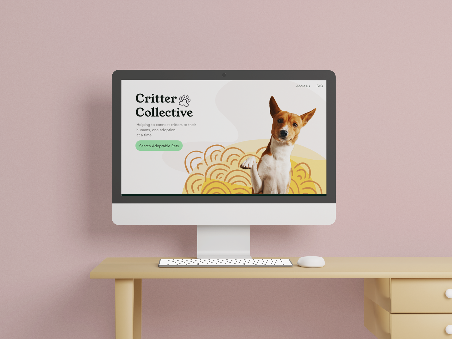
Bouquet preview app for a trendy florist that features a wide range of prices and price filters.
Project duration:
May 2022 - July 2022
The problem:
Users want to preview and purchase bouquets at an affordable price
The goal:
To create an app that provides the customer with a wide range of prices for bouquets that can be previewed before purchasing
My role:
UX/UI Designer
Responsibilities:
Conducting interviews, paper and digital wireframing, low and high-fidelity prototyping, conducting usability studies, accounting for accessibility, and iterating on designs
Understanding the user
User research: summary
User research showed that there is a demographic that is looking for low-cost sentimental gifts. Many floral apps currently on the market do not include a price filter option and/or low-cost options. I went into the research phase with assumptions about what would be available on the market and quickly realized the options were limited and the preview options were also limited. Write a short paragraph describing your user research.
User research: pain points
1. Limited photos of products
Users want more photos and angles of bouquets before they purchase
2. Limited pricing options
Users want more price options and price filters
3. Text size is not accessible
Users want text that is large enough to read easily and or an option to increase the size of the text
User Persona: Jessica
Problem statement:
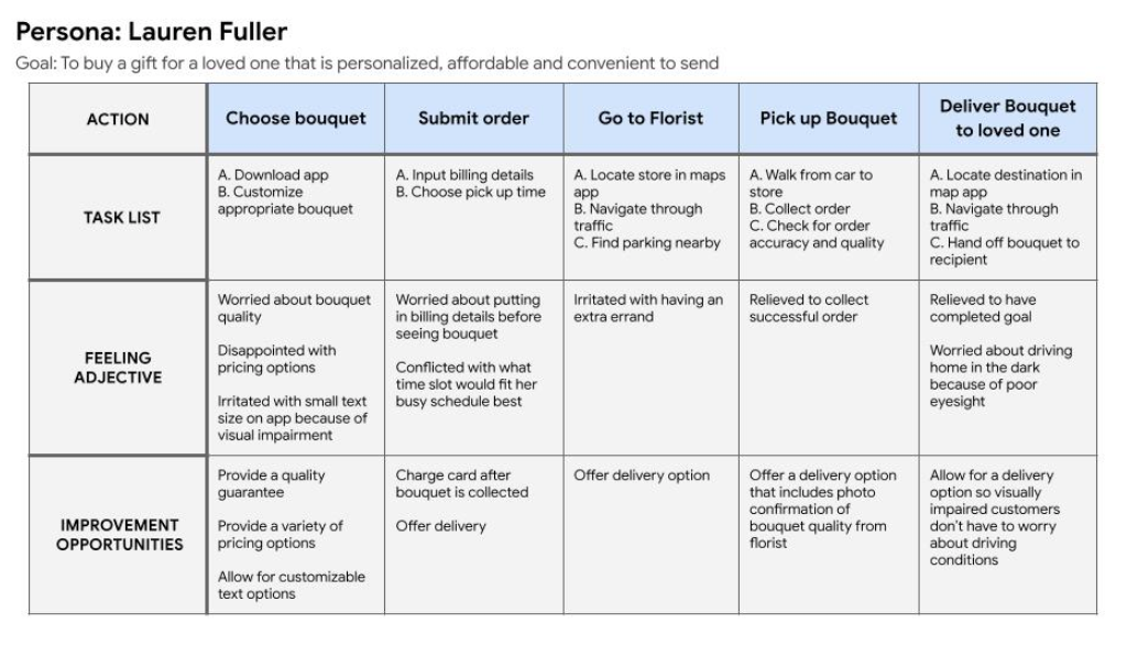
Lauren Fuller is a mother on a tight budget who needs to get her daughter a personalized bouquet at an affordable price because she wants to do something special for her daughter that isn’t too costly
User journey map
Starting the design
Paper wireframes
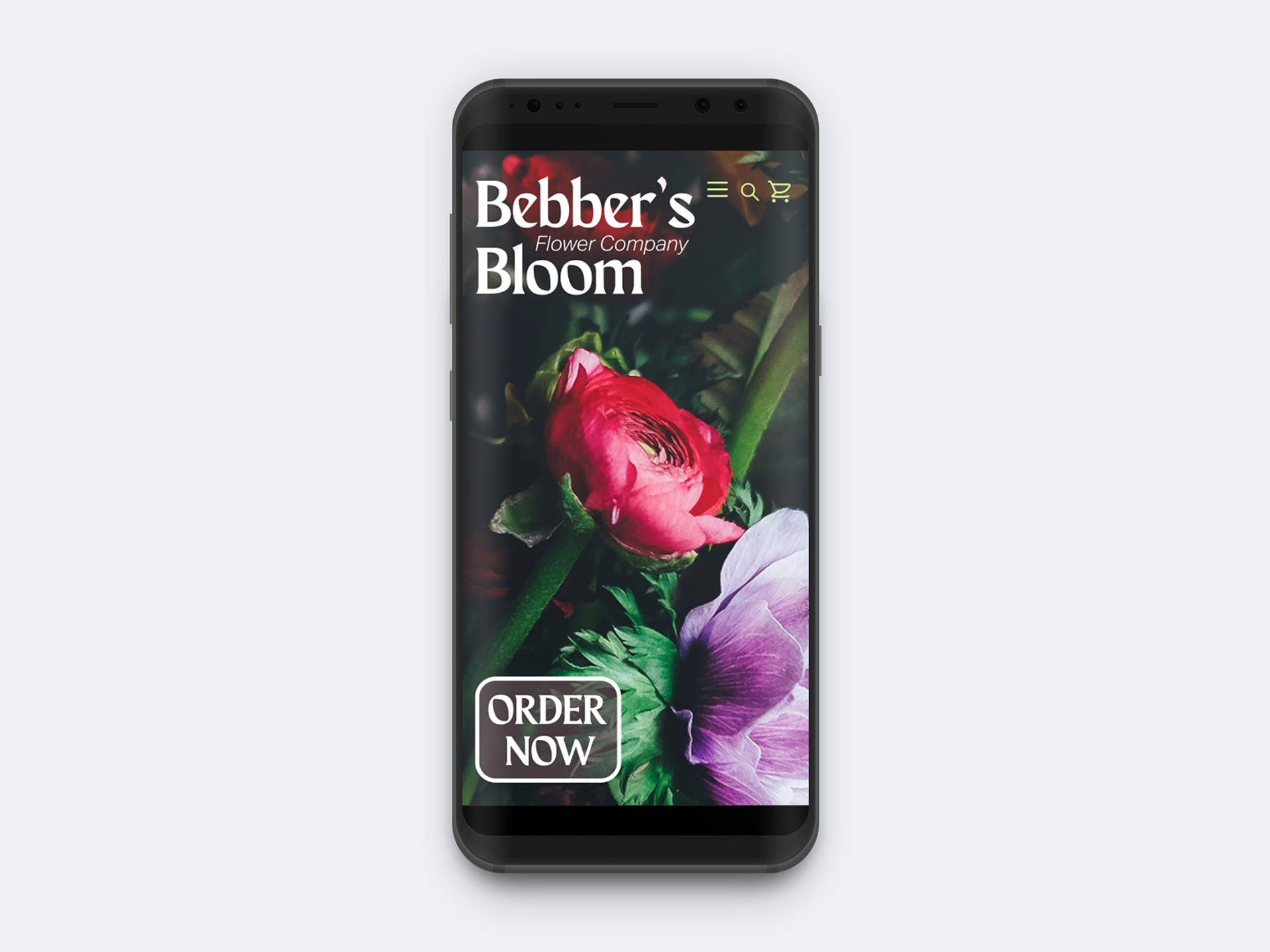
Throughout my iterations, I decided I wanted to make the app very image-centric and I wanted to provide multiple ways to navigate to the main browsing pages
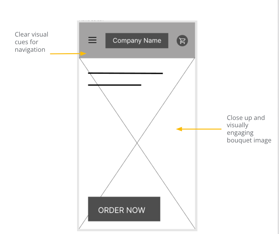
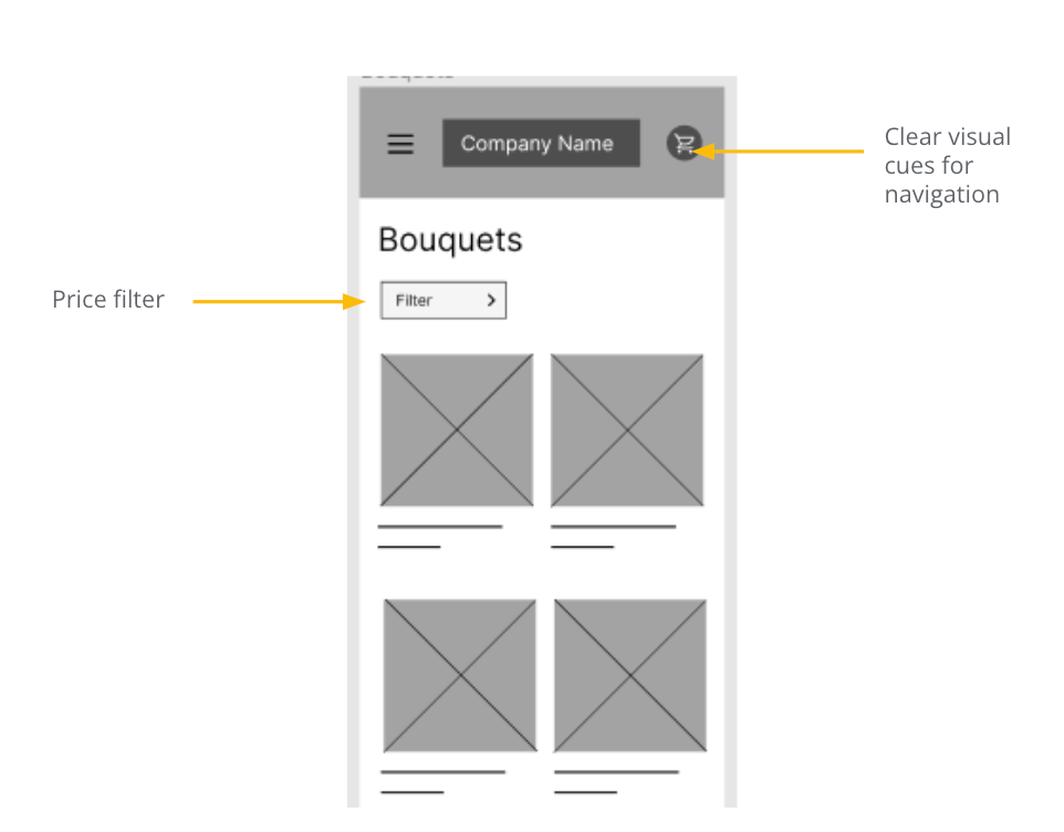
Digital wireframes
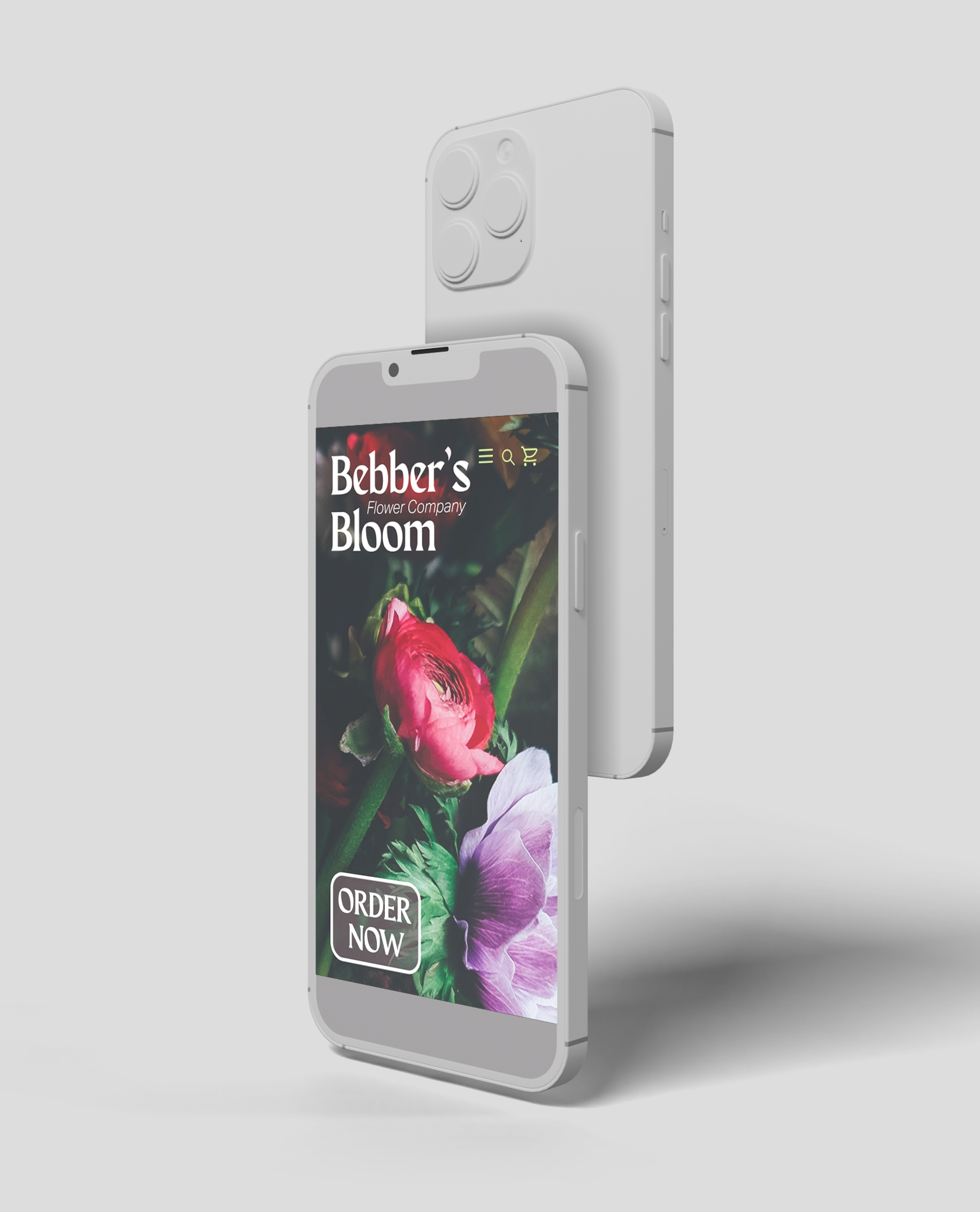
I wanted the first screen the user sees to be image heavy and have strategically placed text over the image
I wanted to ensure that users had an option to filter through bouquets based on pricing
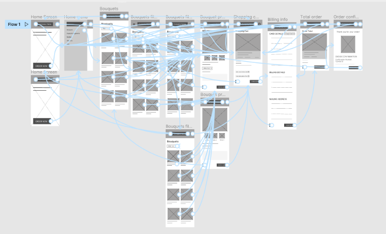
Low-fidelity prototype
Usability study: parameters
I conducted my usability study with 5 participants, 2 male-identifying, and 3 female-identifying. One of which with an accessibility limitation
Usability study: findings
Round 1 findings:
1. Users wanted more customization
2. Users were confused by visual cues on the payment screen
3. Users found navigation easily
Round 2 findings:
1. Users want to be directed to the main menu when the "order now" button is pressed
2. Users wanted more app features
Refining the design
Mockups:
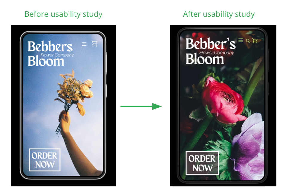
Users commented on being confused by the initial colour pallet because they didn’t associate those colours with buying flowers.
The colour pallet was changed to more commonly used colours associated with flowers
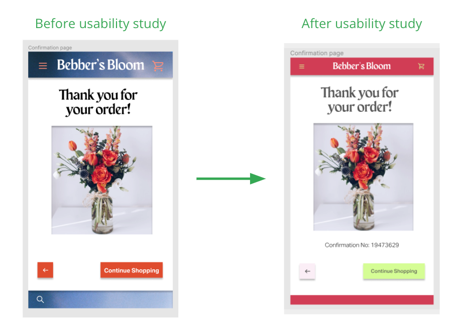
Users found the header was too large and distracting in the initial mockup. The size was reduced and a minimal header was applied
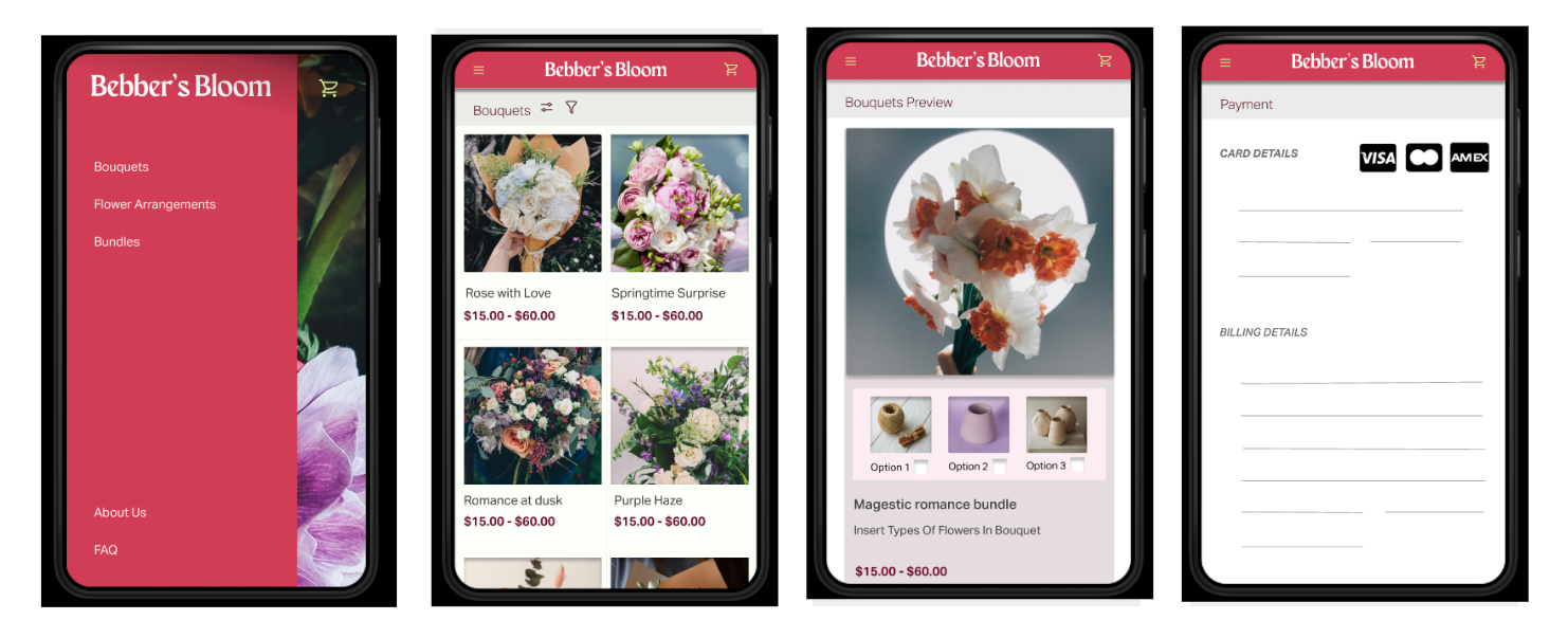
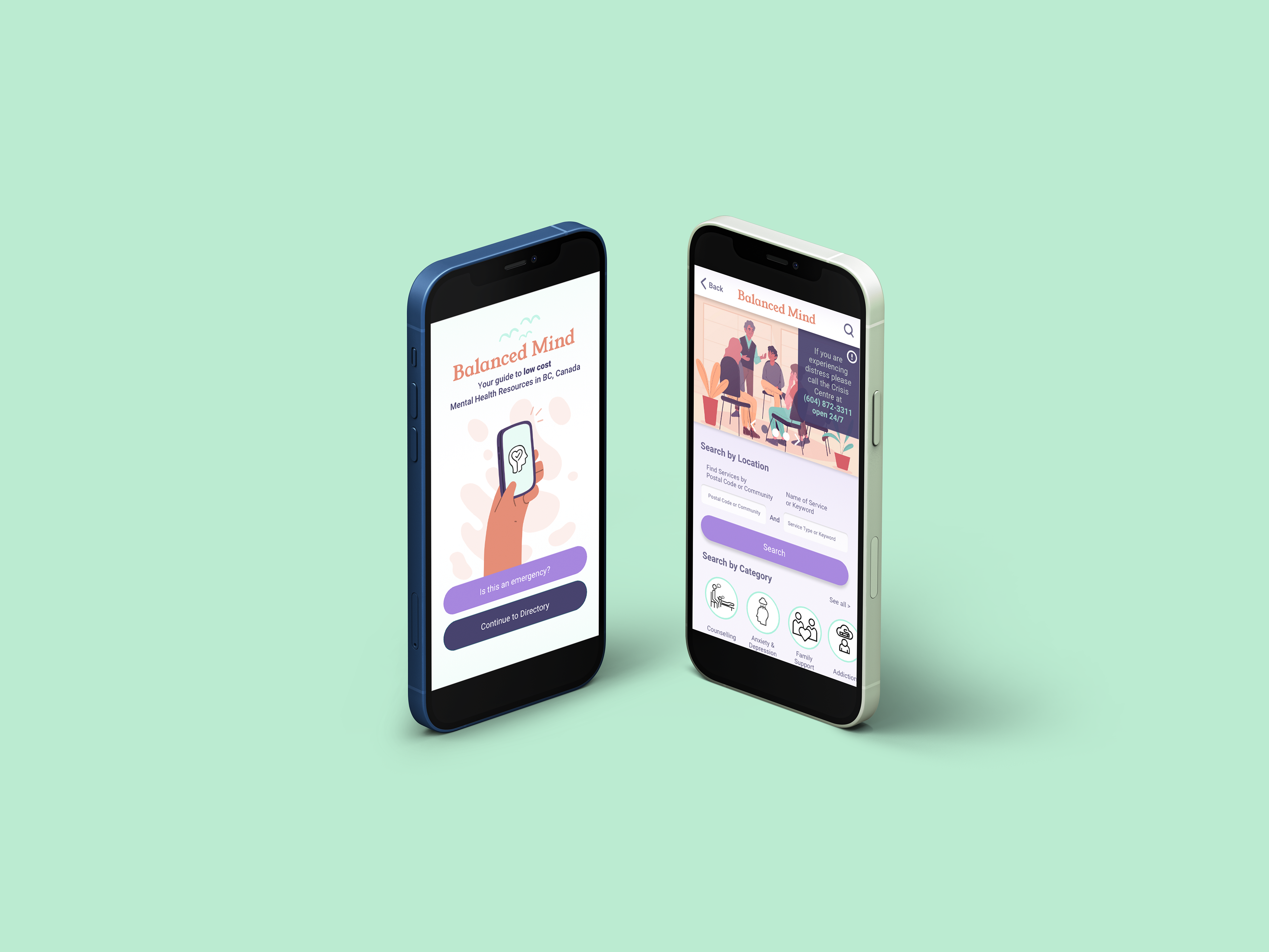
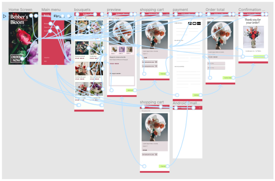
High-Fidelity Prototype
Accessibility considerations
1. All elements have a contrast ratio of 4:1 or higher
2. All elements have been checked for readability depending on all varieties of colour blindness
3. All text abides by standard accessibility guidelines
Going forward
Takeaways
Impact:
Reviewer quote: “Looks great, good idea to add a video aspect”
What I learned:
I learned that animal shelters on the market often have limited images provided of their adoptable animals
which may affect the rate animals are adopted.
Next Steps
1. Further user testing and SUS tests
2. Add a video preview feature that provides users with a 360-degree view of each bouquet
Let's Connect!
If you are interested in collaborating I’d love to hear from you! Feel free to view my portfolio for more examples of my work
email: aoifegkenny1@gmail.com